


Typography is not simply the act of putting letters on a page, typography is the foundation of visual communication. Typography can make the difference between average and exceptional work regardless of whether you are designing a web site, developing a brand, or producing print material. This is a full-fledged guide that strives to provide the designer with critical information and working ideas on how to master typography to ensure the ability to convey messages more easily and come up with a work of visual masterpiece.
The Vitality of Learning Typography
Typography determines the way your audience would look at and relate to your design. The tone of your message and the legibility of your message is formed by the fonts used, the spacing between the letters, and the way the letters are arranged. Bad typography may create a confusion or distance between the audience whereas good typography helps to increase the readability, hierarchy, and the aesthetic appeal.
The fonts are great weapons that can either make or break a design. They provide personality, mood and professionalism. Learning typography involves not only knowing how to pick the fonts, but also knowing the way to mix and manipulate the fonts to serve your design fundamentals tutorial
Learning the Basics of Typography
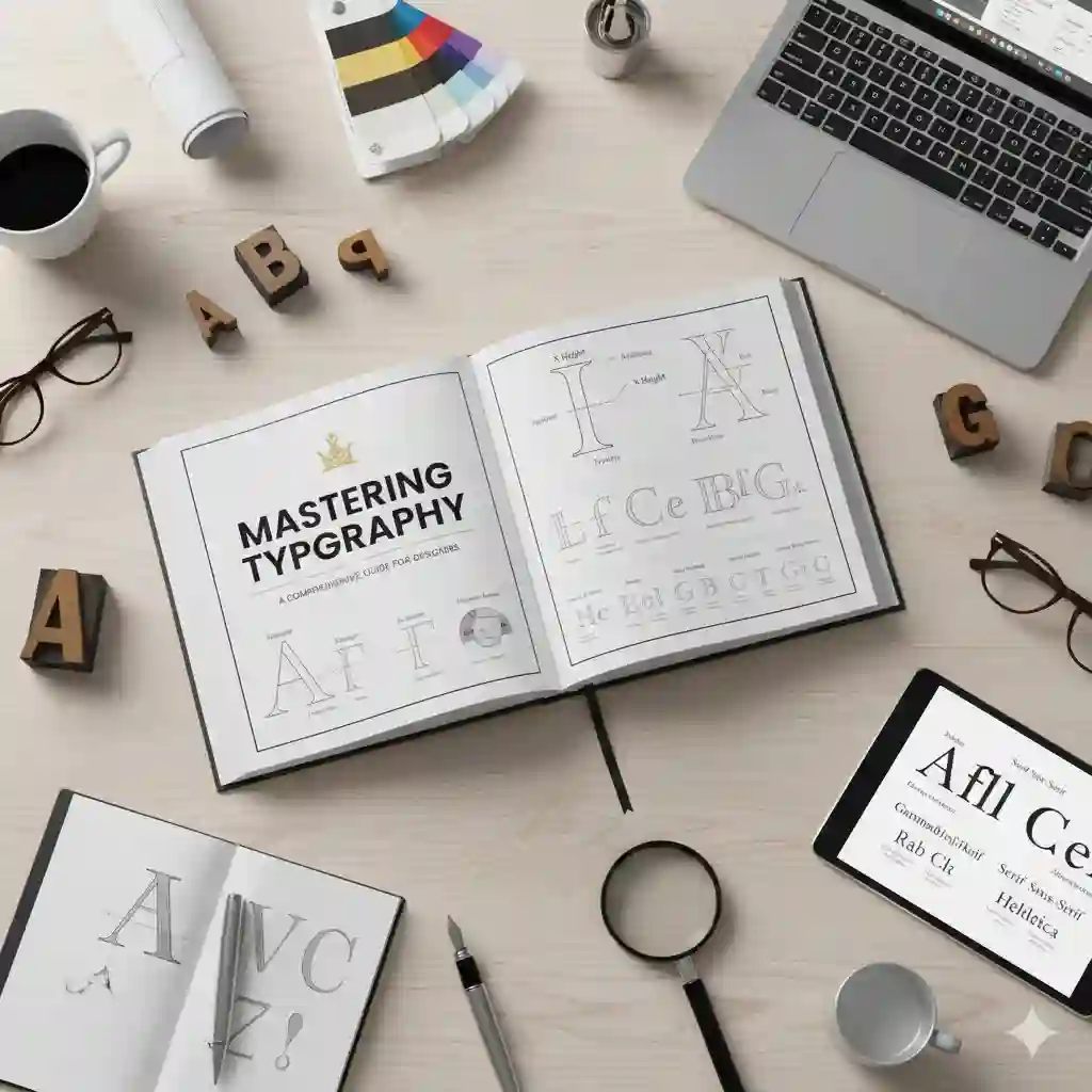
Typeface vs. Font
The confusion with typeface and font is that they are used interchangeably, yet their meaning is different. The design of the letters i.e. Arial or Times New Roman is known as typeface. A font is a particular style of a typeface such as Arial Bold or Times New Roman Italic. The awareness of this differentiation forms the basis of learning typography.
The Fundamentals of Typography
- Kerning: This is the process of modifying the gap between separate letters in order to establish a balanced appearance of the text.
- Tracking: This is the general space between groups of letters that determine the aesthetics and clarity.
- Leading: This is the vertical distance between lines of text, and it is significant to flow and legibility.
- Hierarchy: The arrangement of the text to lead the eye of the reader, by the use of size, weight, and color variations.
- Alignment: The positioning of the text relative to the margins or other objects, affecting both the reading ability and the beauty.
Readability and Legibility
Typography requires the ability to focus on readability (easy text reading) and legibility (easy character identification). Such aspects as font size, contrast, line length, and spacing are all very important.
Choosing the Right Typeface
When selecting the appropriate typeface, one should take into account a message that you intend to deliver and a situation in which your design is to be used. For example:
- The serif fonts are formal and old fashioned which are commonly applied on print in the form of body text.
- Sans-serif fonts are sleek and contemporary, and are popular on the web interface and headlines.
- Script and decorative type face is expressive and should be applied sparingly to emphasise or brand.
- Reflect on what your brand/project is like. The ideal typeface should be in harmony with the tone of your design, and the typeface should improve the user experience.
Font Pairing Techniques
Matching fonts is one of the most difficult parts of typography mastering. When fonts are well matched, they will make harmony and contrast and they will not overload your design.
- Most effective Font Pairing Patterns
- Opposite: Use a contrasting font with a serif font to provide visual effect and balance at the same time.
- Pairing Moods: Select fonts that are of a similar nature or mood e.g. both modern or both classic.
- Hierarchy By Weights: Headings are to be used by a heavier weight font with the body text by lighter weight font.
- Use fewer fonts: You can use a maximum of two or three fonts not to be messy.
- With such strategies, it is easier to develop a unified design, which makes the viewer follow your content in a natural way.
- Setting Type: Practical Tips
Which are the strengths of this presentation?
It is necessary to create effective, regular, and adaptable typography as it is the case with digital platforms. Apply principles of design to ensure that there is consistency in various screens and devices. Specify fonts, font weights, and font spacing in your style guide.
Mastery of Tracking and Kerning
Optimize tracking and kerning. On the example of a large block of text, tracking can be increased to make it more readable, and on the example of a headline, it can be done with fine-tuning of the appearance of a headline.
Accessibility Considerations
Ensure that your typing decisions are friendly. Make the text and the ground contrast enough, do not use too decorative fonts when writing the body, and keep the font size readable.
The Typographical Hierarchy of Design
One of the elements used to determine the hierarchical arrangement of design is typography which helps to focus attention to the most important information by guiding the eyes of the viewer. Strategic use of size, weight, and color:
- Headings: The bigger and bold fonts are eye-catching.
- Subheadings: Minor fonts are slightly smaller and lighter and keep the flow.
- Body Text: The fonts are clear and readable which promotes engagement.
- Captions and Footnotes: Bigger fonts that are not so emphasized.
Learning how to type typographically makes learning how to get your message across the screen so that your audience gets to eat the information the way you want.
Chronicle and Development of Typography
The study of typography history helps you to enliven your design viewpoint. Since the inception of movable type, typography has been changing along with technology and culture. This is because this knowledge allows designers to value the origins of their profession and motivates creative uses.
Conclusion
Typography is an art that must be mastered by any designer who believes in proper communication and heart-thumping visuals. It needs attention to detail, profound knowledge of principles and experience. By mastering typography, you: